You’ve got a scanner spitting out thousands of findings a month, and someone on your team still has to decide which ones actually matter. That’s the gap vulnerability management dashboards are built to close. Without one, security teams end up buried in spreadsheets, chasing CVE numbers with no real sense of business impact or exploitability.
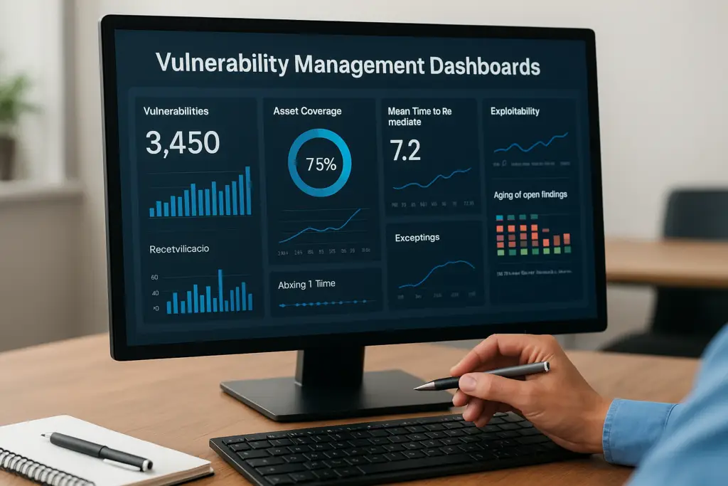
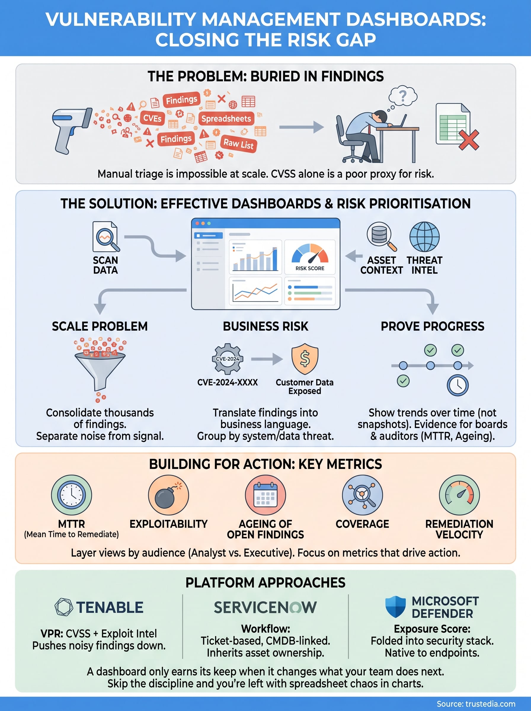
A vulnerability management dashboard pulls scan data, asset context, and threat intelligence into one screen so you can see risk prioritisation at a glance rather than a raw list of flaws. Good ones show trends over time, not just a snapshot, so you can prove whether your patching programme is actually working or just treading water. Platforms like Tenable, ServiceNow, and Microsoft Defender all approach this differently, and picking the right one depends on how your team actually works.
In this article, we break down what belongs on a proper dashboard, the key metrics worth tracking, and how the major platforms handle prioritisation and remediation tracking. We work with these tools daily supporting clients through vulnerability assessment services and ongoing security operations, so we’re drawing on what we see actually move the needle, not vendor marketing.
Why vulnerability management dashboards matter
Most mid-sized organisations carry thousands of open vulnerabilities at any given time, and that number only grows as scanning coverage improves. Trying to triage that manually in a spreadsheet is a losing game. Analysts burn hours cross-referencing CVE scores against asset lists, and by the time a report is finished, the data is already stale. A vulnerability management dashboard exists precisely to stop that cycle, giving you a living view of exposure instead of a monthly snapshot that’s out of date the moment it lands in someone’s inbox.
The scale problem no spreadsheet solves
Scanners like those from Tenable or Qualys, whether you are running internal or external vulnerability scans, can generate tens of thousands of findings across a mid-sized estate in a single sweep. Without a dashboard consolidating that output, teams default to fixing whatever looks scariest by CVSS score alone, which is a poor proxy for actual risk. A finding rated 9.8 on an isolated test server matters far less than a 7.5 sitting on an internet-facing payment system. Asset context, the kind that comes from proper attack surface management, is what separates noise from signal, and that context only becomes usable when it’s surfaced automatically rather than pieced together by hand.
Turning technical findings into business risk
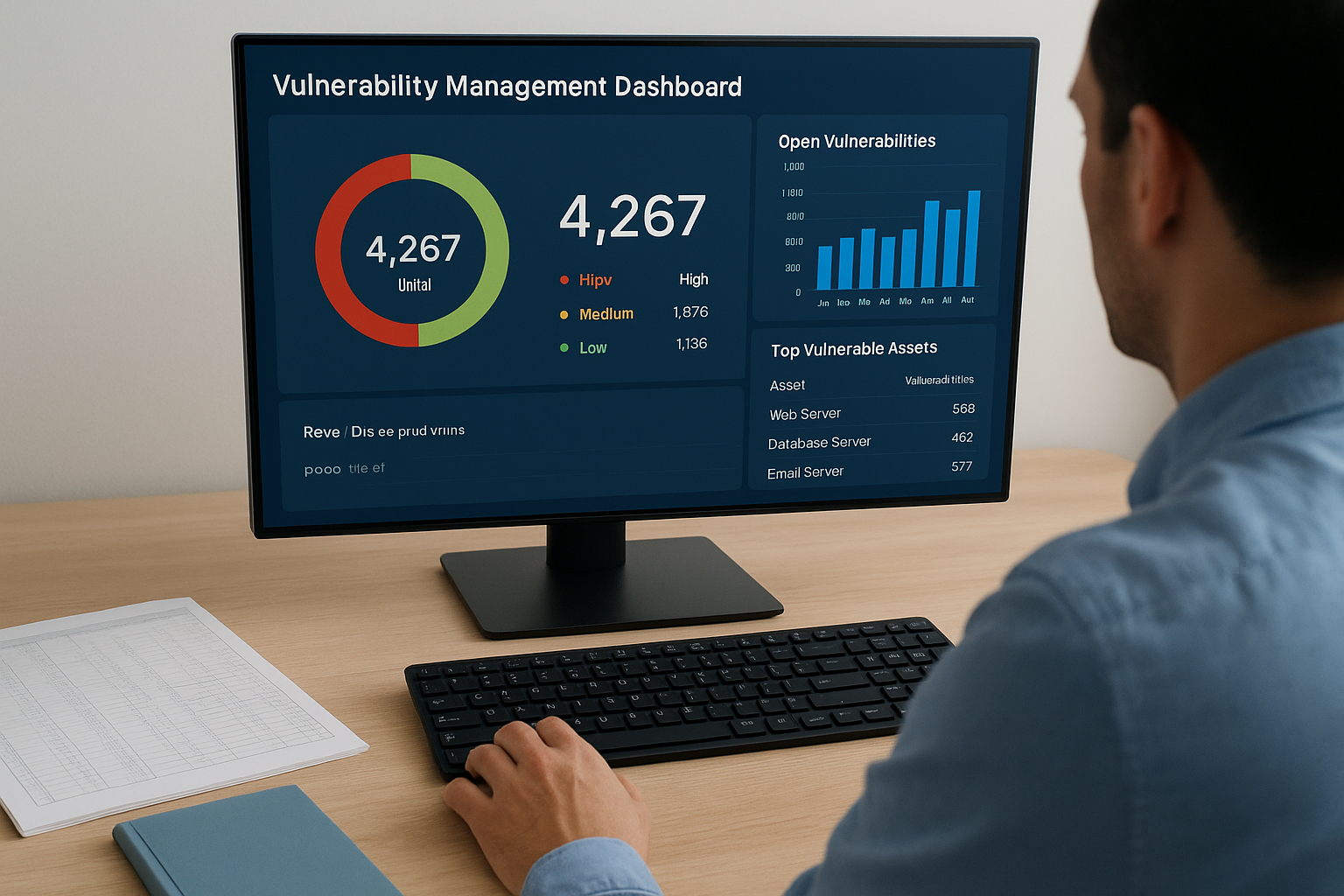
Boards and department heads don’t want to hear about CVE-2024-XXXX. They want to know whether customer data is exposed and how long it’ll take to fix. A well-built dashboard translates raw findings into business risk language, grouping vulnerabilities by the systems and data they threaten rather than just their technical severity. This is where most home-grown tracking falls apart: it stays stuck at the technical layer and never bridges into something a non-technical stakeholder can act on.
A dashboard that only shows severity scores is a vulnerability list with a nicer font, not a risk management tool.
Proving progress to the board and auditors
Compliance frameworks expect evidence, not intentions. ISO 27001 auditors, cyber insurers, and boards all ask the same underlying question: can you show that vulnerabilities get identified, prioritised, and closed within a defined timeframe? A dashboard that tracks mean time to remediate, ageing of open findings, and coverage by asset group gives you that evidence on demand, rather than forcing someone to build a report from scratch every audit cycle. If your organisation is working toward or maintaining ISO 27001 certification, this kind of continuous evidence trail is often the difference between a smooth audit and a stressful one.
Organisations that lack this visibility tend to discover their biggest gaps the hard way, usually during an incident or a failed audit finding. That’s the real cost of skipping a proper dashboard: not just wasted analyst time, but blind spots that surface at the worst possible moment.
How to build an effective vulnerability management dashboard
Building a dashboard that people actually use starts with deciding who’s looking at it and what decision they need to make, and the NIST vulnerability management framework is a sensible reference point for that structure. A technical analyst needs granular filtering by asset, CVE, and exploit availability. A CISO needs three or four numbers that tell the story of exposure and trend. Trying to serve both audiences on one screen usually ends up serving neither, so layered views matter more than a single all-purpose page.
Pick metrics that reflect real risk, not vanity numbers
Raw vulnerability counts look impressive in a report but tell you almost nothing about whether you’re safer this month than last. Focus on metrics that connect to action:
- Mean time to remediate (MTTR), broken down by severity and asset criticality
- Exploitability, flagging vulnerabilities with known exploits in the wild over theoretical CVSS scores alone
- Ageing of open findings, especially anything past your internal SLA
- Coverage, showing what percentage of your estate is actually being scanned
- Remediation velocity by team, so bottlenecks are visible before they become audit findings
If a metric doesn’t change someone’s next action, it doesn’t belong on the dashboard.
Layer the data by audience and urgency
Structure the dashboard so an analyst can drill from a high-level risk score down into the specific host, port, and patch needed, without switching tools. Executives should see a summary view refreshed automatically, not a static export someone rebuilds every month. Quarterly reviews, board packs, and audit evidence should all be able to pull straight from the same live data source rather than a parallel spreadsheet that inevitably drifts out of sync. This is exactly the kind of structured risk prioritisation we build into our own vulnerability assessments, so clients get one consistent source of truth rather than three versions of the same picture.
How leading platforms approach vulnerability dashboards
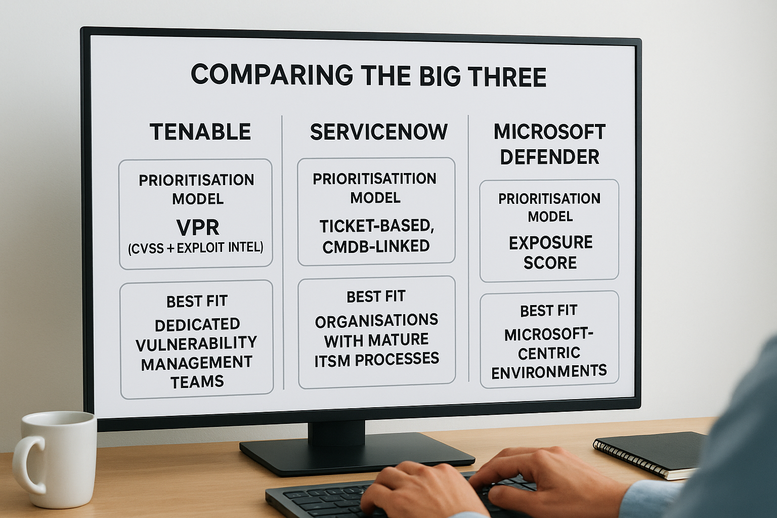
Every major platform tackles prioritisation differently, and knowing those differences helps you set expectations before you buy or deploy. Tenable leans heavily on its Vulnerability Priority Rating, which blends CVSS with real-world exploit intelligence to push the noisy 9.8s down the list when nothing is actively exploiting them. ServiceNow takes a different angle, treating vulnerabilities as workflow items tied to your CMDB, so remediation tickets inherit asset ownership and business criticality automatically. Microsoft Defender for Endpoint folds vulnerability data into its broader exposure score, which works well if you’re already living in the Microsoft security stack but less well if your estate is mixed.
Comparing the big three
Here’s how the approaches stack up on the features most teams care about:
| Platform | Prioritisation model | Best fit |
|---|---|---|
| Tenable | VPR (CVSS + exploit intel) | Dedicated vulnerability management teams |
| ServiceNow | Ticket-based, CMDB-linked | Organisations with mature ITSM processes |
| Microsoft Defender | Exposure score, native to endpoints | Microsoft-centric environments |
No platform out of the box knows your business context better than the people running it.
Why platform choice isn’t the whole answer
None of these tools solves the problem alone. Tenable’s VPR is only as useful as the asset context feeding it. ServiceNow’s workflows are only as fast as the SLAs someone configures. Defender’s exposure score only reflects endpoints, not your broader network or cloud estate. Picking a platform is a starting point, not a finish line, and it still needs someone tuning thresholds, validating asset criticality, and chasing owners when tickets stall, which is why clearly defined vulnerability management roles matter as much as the tooling.
Questions worth asking before you commit to any single tool include whether it integrates with your existing scanners, whether it handles cloud and on-prem assets equally well, and whether your team has the capacity to maintain it properly. That last point trips up more organisations than the software itself ever does, which is where a managed vulnerability assessment service earns its keep.
Putting your dashboard to work
A dashboard only earns its keep when it changes what your team does next. Get the metrics right, layer the views by audience, and pick a platform that matches how your organisation actually operates, and you turn a wall of raw findings into a working risk prioritisation system that analysts, executives, and auditors can all trust. Skip that discipline and you’re left with the same spreadsheet chaos dressed up in charts.
None of this happens by accident. Someone still needs to tune thresholds, validate asset context, and keep the whole thing honest month after month, which is exactly where most in-house efforts stall. If you’d rather have specialists build and run that system for you, our vulnerability assessment service uncovers external, internal, and cloud weaknesses and hands back a prioritised remediation plan your board can actually act on.